Misc
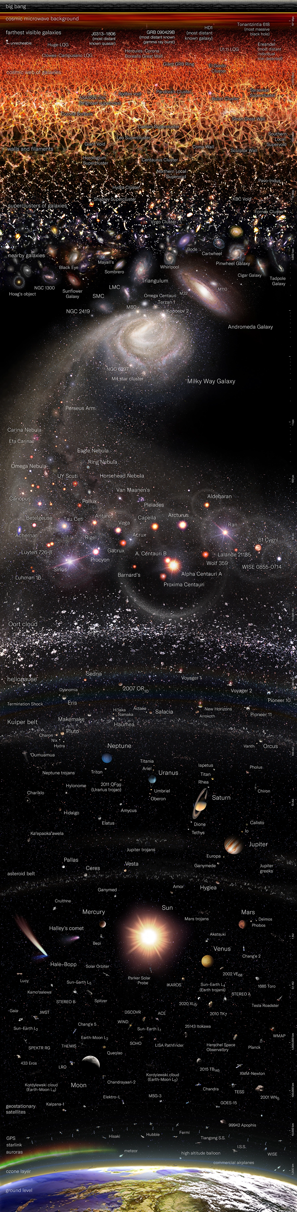
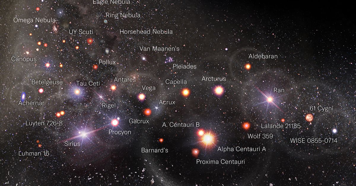
A Logarithmic Map of the Entire Observable Universe
Article/Editing:
For a full-size option or to inquire about posters, please visit Pablo Carlos Budassi’s website.
A Logarithmic Map of the Entire Observable Universe
Among the scientific community, it’s widely believed that so far humans have only discovered about 5% of the universe.
Yet, despite knowing about just a fraction of what’s out there, we’ve still managed to discover galaxies billions of light-years away from Earth.
This graphic by Pablo Carlos Budassi provides a logarithmic map of the entire known universe, using data by researchers at Princeton University and updated as of May 2022.
How Does the Map Work?
Before diving in, it’s worth touching on a few key details about the map.
First off, it’s important to note that the celestial objects shown on this map are not shown to scale. If it was made to scale with sizes relative to how we see them from Earth, nearly all of the objects would be miniscule dots (except the Moon, the Sun, and some nebulae and galaxies).
Secondly, each object’s distance from the Earth is measured on a logarithmic scale, which increases exponentially, in order to fit in all the data.
Within our Solar System, the map’s scale spans astronomical units (AU), roughly the distance from the Earth to the Sun. Beyond, it grows to measure millions of parsecs, with each one of those equal to 3.26 light-years, or 206,000 AU.
Exploring the Map
The map highlights a number of different celestial objects, including:
- The Solar System
- Comets and asteroids
- Star systems and clusters
- Nebulae
- Galaxies, including the Milky Way
- Galaxy clusters
- Cosmic microwave background—radiation leftover from the Big Bang
Featured are some recently discovered objects, such as the most distant known galaxy to date, HD1. Scientists believe this newly-discovered galaxy was formed just 330 million years after the Big Bang, or roughly 8.4 billion years before Earth.
It also highlights some newly deployed spacecraft, including the James Webb Space Telescope (JWST), which is NASA’s latest infrared telescope, and the Tiangong Space Station, which was made by China and launched in April 2021.
Why is it called the “Observable” Universe?
Humanity has been interested in space for thousands of years, and many scientists and researchers have dedicated their lives to furthering our collective knowledge about space and the universe.
Most people are familiar with Albert Einstein and his theory of relativity, which became a cornerstone of both physics and astronomy. Another well-known scientist was Edwin Hubble, whose findings of galaxies moving away from Earth is considered to be the first observation of the universe expanding.
But the massive logarithmic map above, and any observations from Earth or probes in space, are limited in nature. The universe is currently dated to be around 13.8 billion years old, and nothing in the universe can travel faster than the speed of light.
When accounting for the expansion of the universe and observed objects moving away from us, that means that the farthest we can “see” is currently calculated at around 47.7 billion light-years. And since light takes time to travel, much of what we’re observing actually happened many millions of years ago.
But our understanding of the universe is evolving constantly with new discoveries. What will we discover next?

This article was published as a part of Visual Capitalist's Creator Program, which features data-driven visuals from some of our favorite Creators around the world.


Misc
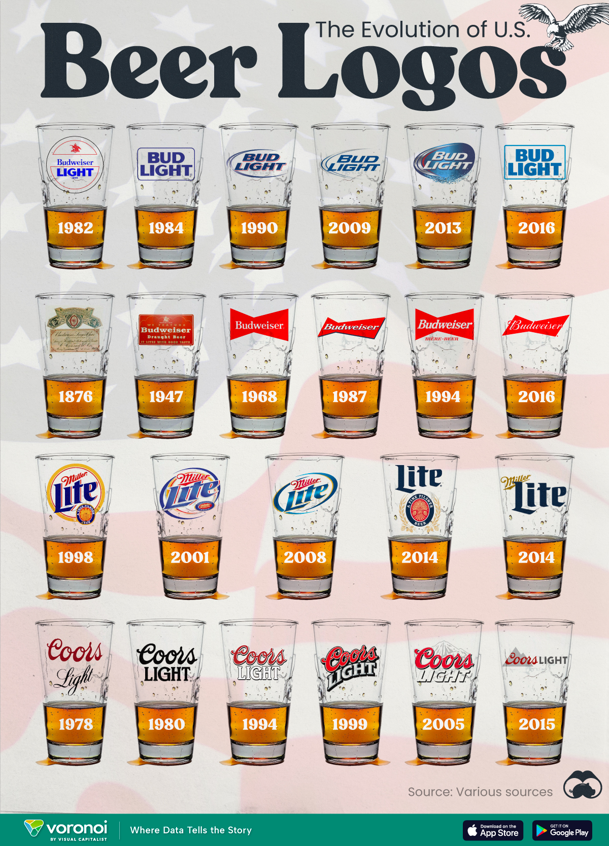
The Evolution of U.S. Beer Logos
In this graphic, we analyze the evolution of popular U.S. beer logos like Budweiser, Coors Light, Bud Light, and more.

The Evolution of U.S. Beer Logos
This was originally posted on our Voronoi app. Download the app for free on iOS or Android and discover incredible data-driven charts from a variety of trusted sources.
Despite selling a popular product, beer companies have to be creative to stand out in a competitive market.
In this graphic, we analyze the evolution of some U.S. beer logos based on various sources. We chose brands based on a mixture of criteria, including popularity (based on YouGov surveys), availability of logo assets, and those with interesting developments.
Bud Light Back to the ’80s
Despite recent backlash and calls for a boycott after sending a commemorative can to transgender influencer Dylan Mulvaney, Bud Light remains one of America’s best-selling beers.
The brand of light beer, owned by the Anheuser-Busch company, has switched from its more circular logo with italic letters adopted in the 1990s back to the Bud Light badge of the 1980s. It is composed of heavy uppercase lettering, written in two levels in a shade of blue with the inscription placed on a solid white background and enclosed in a thin rectangular frame.
Miller Lite Goes Old School
After following a similar approach to Bud Light’s branding throughout the 2000s, Miller Lite decided to undergo a major rebranding in 2014.
The company returned to its 1970s roots, once again combining a white can with its original blue, gold, and red logo. The redesign was largely considered a success, given that Miller Lite sales immediately increased following the change.
A Symbol of American Brewing
The oldest brand on our U.S. beer list, the Budweiser logo, has undergone more than 15 changes over the years.
The design of two connected triangles represents a red bow tie, as a symbol of American brewing.
The colors of the Budweiser logo include a vibrant red, which helps the logo stand out and be easily recognizable from a distance. Studies also suggest that the color red stimulates appetite. Meanwhile, the white inscription symbolizes purity and cleanliness.
Curious to learn more about the beer market? Check out this graphic about global beer consumption.

-

 Economy7 days ago
Ranked: The Top 20 Countries in Debt to China
-

 Demographics2 weeks ago
The Countries That Have Become Sadder Since 2010
-

 Money2 weeks ago
Charted: Who Has Savings in This Economy?
-

 Technology2 weeks ago
Visualizing AI Patents by Country
-

 Economy2 weeks ago
Economic Growth Forecasts for G7 and BRICS Countries in 2024
-

 Wealth2 weeks ago
Charted: Which City Has the Most Billionaires in 2024?
-

 Technology1 week ago
All of the Grants Given by the U.S. CHIPS Act
-

 Green1 week ago
The Carbon Footprint of Major Travel Methods